For some years now the Scandinavian style has taken center stage in the design industry. I admit I am an absolute fan of its simplicity and purity in design without forgetting practicality.
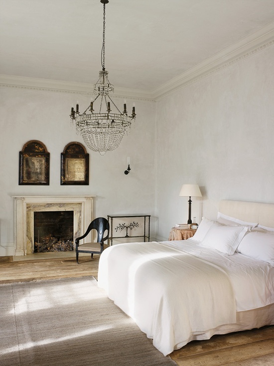
But while that is all very well balanced and often pretty too, I have started to find myself a bit bored after seeing too many all-white interiors (walls, ceilings, flooring, even furniture, all white!). It's true that you can introduce colour with accessories but I think the all-white scheme leaves a feeling of things not being quite finished yet, like you have just primed the walls but still need to paint the top coats (in another colour than white, that is).
So since I started working in the paint and wallpaper industry I have decided that maybe it's my turn now to share with the world a bit of inspiration on colour schemes that include
colour because pure white can't really be called a "colour" as it hasn't got any hue.
I will start with the introduction of black, that dark colour (although again black is the absence of all colours) opposite to white. If the use of dark colours in interiors can often be daunting, the use of black as an accent wall or mixed with white can give your house a very contemporary look without you having to sacrifice brightness.
Marlien Rentmeester's home
This is a good example of how to use a bit of black. The horizontal stripes work particularly well in a hallway as it gives a sense of length and direction towards other rooms (just make sure your ceiling isn't too low or it could look like a box).
If you want to make a space more interesting and show a feature like this mezzanine level with a spiral staircase then painting it black or dark grey is a good way of doing it. The good thing about black is that it goes with everything.
Home of Bernadette Pascua and Andrew Stinson
To make a room feel more intimate and cosy without introducing any colour that might then narrow down your choice in furniture or accesories, then black again is the answer. Just make sure you have got plenty of light so the room doesn't feel like a cave!
So I think this is a way to make a boring room look interesting and feel contemporary.
What do you think of black now, as daunting as before or not?
If you liked this post you might want to follow my board
Colours in Pinterest.
x


